Branding Portfolio
We are dedicated to creating compelling and memorable brands. Here, you can explore our past projects and see the impact we’ve made for our clients. Our expertise spans various industries, and we take pride in delivering creative and strategic branding solutions.
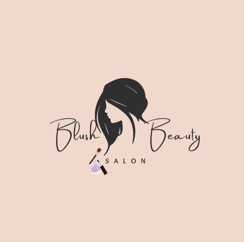
Color Scheme
- Background: Soft blush pink
- Silhouette and Text: Black
- Beauty Tools: Subtle accents in realistic colors
Elements:
- Silhouette of a Woman: Represents beauty and elegance.
- Cursive Typography: Adds sophistication.
- Sans-Serif Typography: Provides clarity and professionalism.
- Beauty Tools (Makeup brush and perfume bottle): Highlight the salon’s services.
Overall Aesthetic:
- The logo combines elegance with a modern aesthetic, appealing to clients seeking high-quality beauty services.
- The soft color palette and design elements convey relaxation and luxury, key attributes of the salon experience.
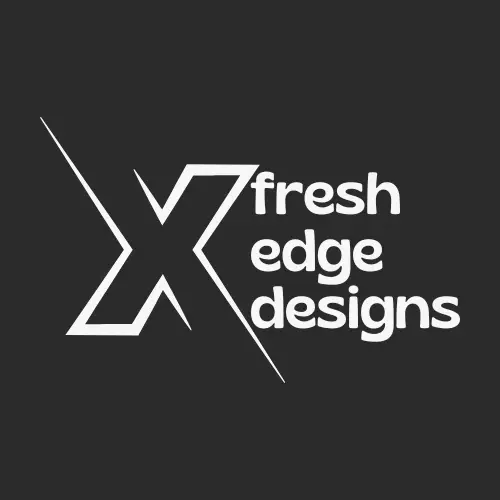
Color Scheme
- Background: Black
- Text and Design Elements: White
Elements:
- Large “X”: The prominent and diagonally split “X” represents the “edge” in Fresh Edge Designs, symbolizing innovation and cutting-edge creativity.
- Playful Rounded Font: The use of a rounded lowercase font for “fresh edge designs” adds a friendly and approachable feel to the logo, balancing the boldness of the “X.”
- Diagonal Split: The diagonal split of the “X” introduces a dynamic and energetic element, suggesting forward movement and modern design principles.
Overall Aesthetic:
- The logo combines boldness with a modern and approachable aesthetic, appealing to clients looking for fresh and innovative design solutions.
- The monochromatic color scheme of black and white ensures a strong visual impact and timelessness.
- The playful yet professional design reflects the company’s creative approach and commitment to delivering unique and engaging designs.
Color Scheme
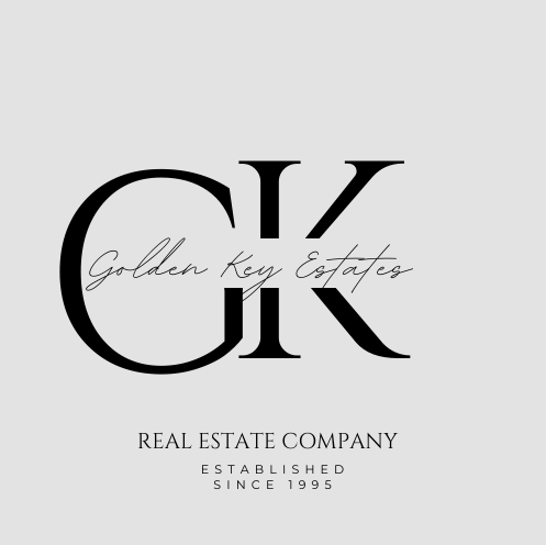
- Background: Light grey
- Text and Initials: Black
Elements:
- Initials “GK”: Bold and elegant, representing the company’s identity and establishing a strong visual presence.
- Cursive Typography for “Golden Key Estates”: Adds a touch of sophistication and elegance, creating a refined contrast with the bold initials.
- Serif Typography for “Real Estate Company” and “Established Since 1995”: Provides a clean, professional look, emphasizing the company’s credibility and longevity.
Overall Aesthetic:
- The logo combines boldness with elegance, appealing to clients looking for premium real estate services.
- The minimalist design and monochromatic color scheme convey a sense of luxury and timelessness.
- The use of both cursive and serif fonts creates a balanced and visually appealing contrast, highlighting the company’s name while maintaining professionalism.
Color Scheme
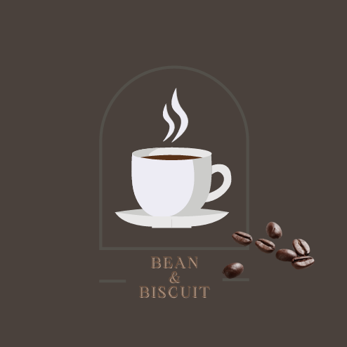
- Background: Dark brown
- Coffee Cup: White with brown coffee
- Coffee Beans: Dark brown
- Text: Light brown
Elements:
- Steaming Coffee Cup: Represents warmth, comfort, and the main product offering of the café.
- Arched Outline: Adds an elegant and timeless feel to the logo, reminiscent of traditional café signage.
- Coffee Beans: Highlight the emphasis on high-quality coffee.
- Stylish Serif Font: The use of a serif font for “BEAN & BISCUIT” adds a sophisticated and classic touch to the logo.
Overall Aesthetic:
- The logo combines a cozy, welcoming vibe with a touch of elegance, appealing to customers looking for a comfortable place to enjoy coffee and treats.
- The dark brown color scheme conveys warmth and richness, enhancing the inviting atmosphere of the café.
- The balance between the modern elements (the steaming cup and coffee beans) and the classic elements (the arched outline and serif font) reflects a blend of tradition and contemporary charm.
Let’s Collaborate
We’d love to help you build a strong and impactful brand. Contact us to discuss your project and discover how we can bring your vision to life.
